Since 2018, Beyou has been outfitting Vancouverites with trendy clothes, designed by locals. They work with a diverse range of people from different cultures, to emulate the diversity of the region. They believe in the power of self-expression, and giving people an outlet to show who they truly are. After a big growth spurt in late 2023, they started to see the bigger future of the brand, and felt that investing in branding would help take them to the next step. They reached out to us, and we determined that a full brand visual package would suit them best.
Services
Brand Visual Design
Year
2024
Creative Direction
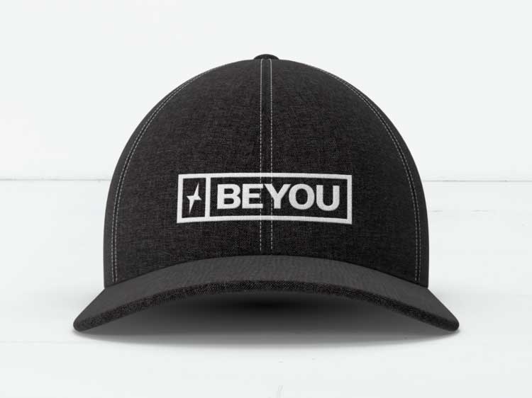
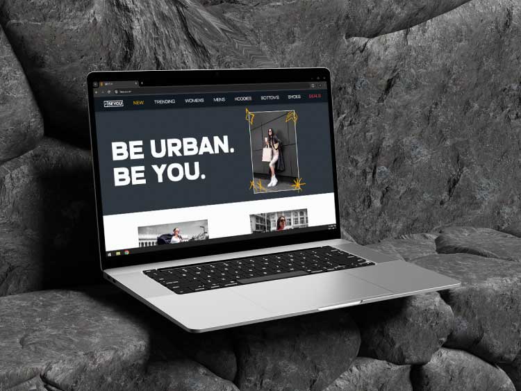
After our discovery phase, we identified a few key traits that the design should incorporate. Since the logo will be used across a number of different mediums, versatility was very important. Making sure the design is still legible and identifiable at smaller and larger scales was vital. It’s also important that the design could be used on a variety of different styles, as the brand prides itself on not fitting into one mold when it comes to fashion. With this in mind, we felt that a clean, modern design would work best as they’re typically the most versatile, and won’t clash with the design of their articles.
Type & Colour
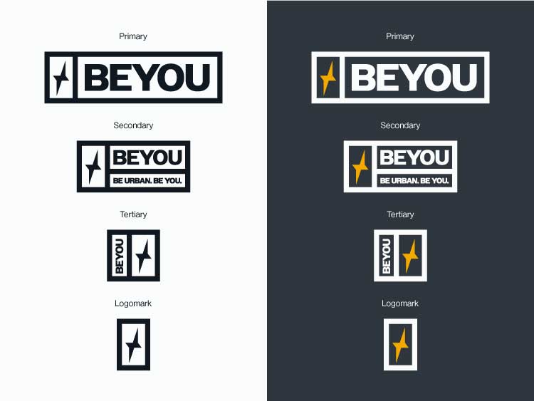
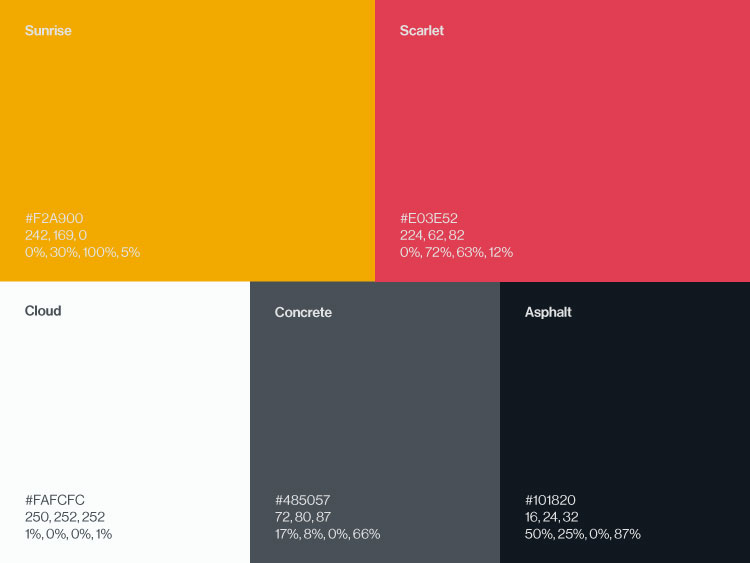
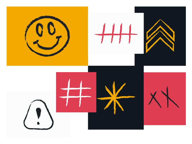
Choosing the right typeface(s) and colour can be a fun, yet difficult part of brand design. They both play a huge role in conveying a better picture of who the brand is, and helps to guide the viewers emotionally. For Beyou, we felt that it was important to keep the colour palette small, and to make good use of the colours they have at their disposal. With that in mind, we chose a strong orange to give a sense of energy, as well as a ripe watermelon red, to give accent the sense of energy with warmth.
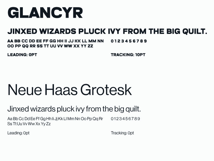
Choosing the right typefaces to go along with the logo is just as important. We decided that having a big, bold heading font would work well, especially paired with a more sleek, modern typeface. Eventually, we settled on using Glancyr as the H1 font, and Neue Haas Grotesk as the H2 & body fonts.
Brand Assets
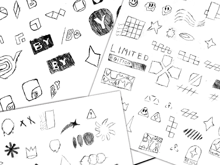
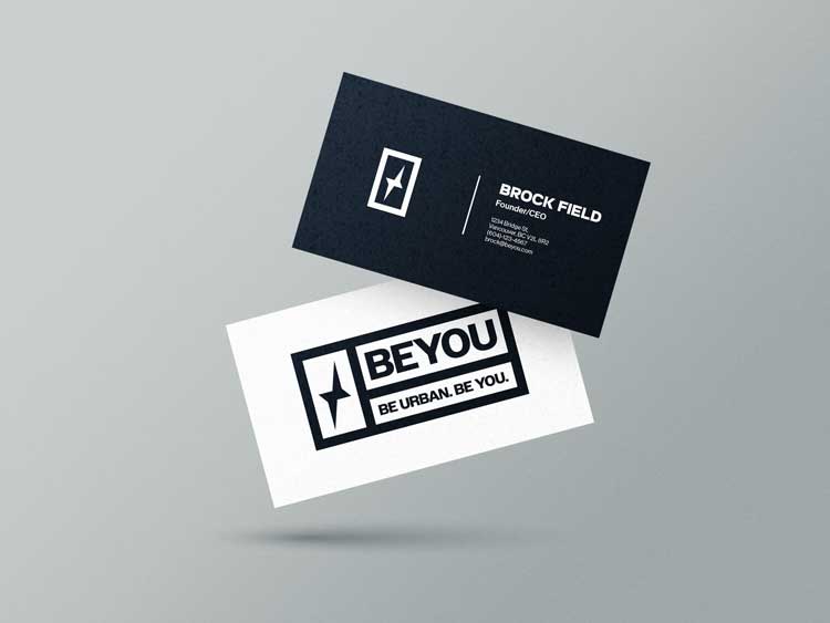
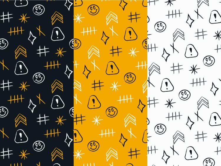
While the logo itself is relatively simple, we felt that adding a bit more personality into the brand, in the form of illustrations and patterns, would be fitting. We decided on a handrawn look to add some asymmetry to the brand. In the end the goal is to create a visual representation of the brand, and all assets delivered on this project achieve that goal.